
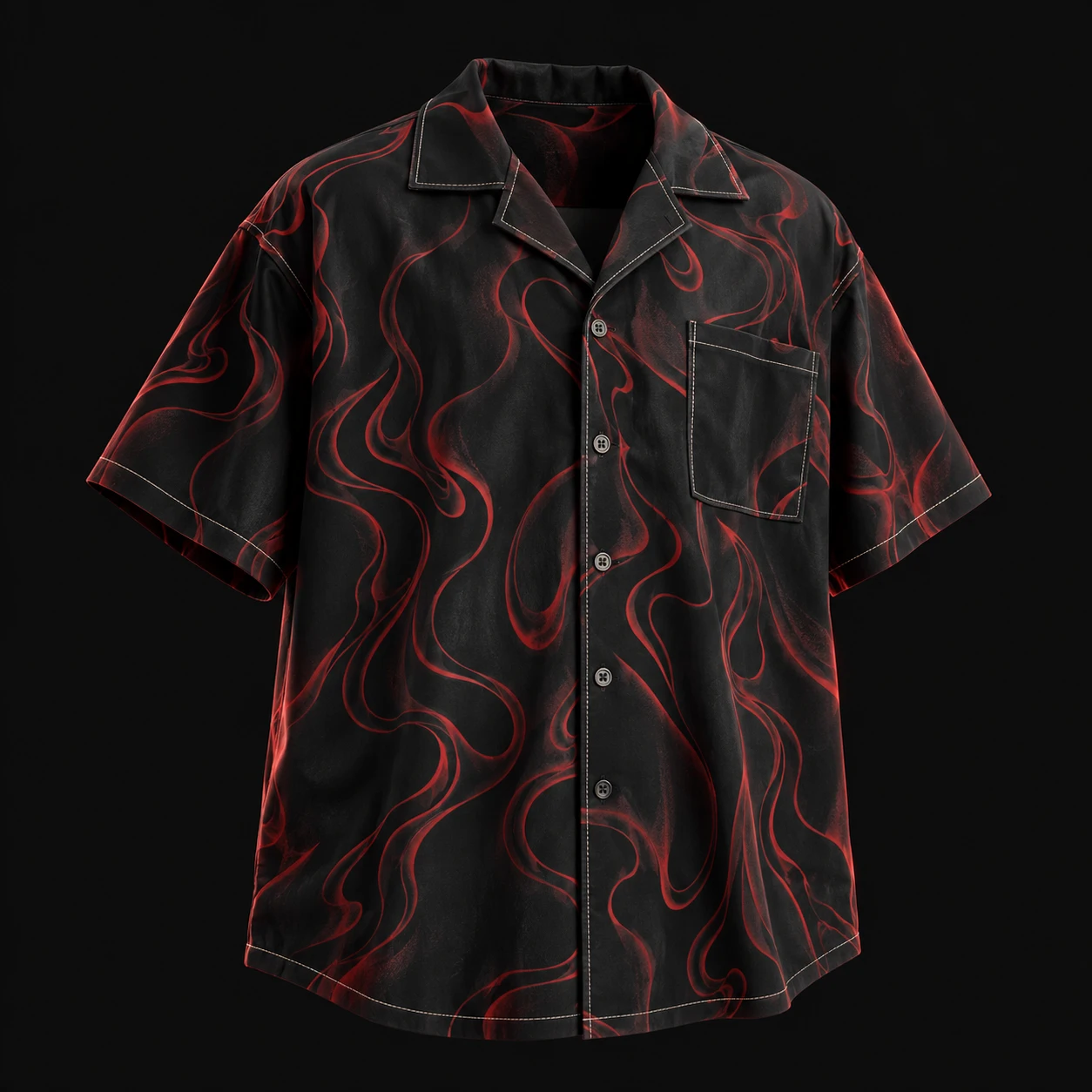
What should a colour strike-off answer?
In this guide, a strike-off means a physical trial print submitted for review. Confirm the term and sample scope with your supplier: it should be clear whether you are assessing a small motif, a complete repeat or a larger printed panel. The important question here is whether the proposed colour relationships work on the actual material.
For a Canadian brand developing a printed button-up, separate three approvals: artwork layout, colour reproduction and the assembled garment. Our existing placement-versus-repeat guide covers layout and seam alignment. This checklist focuses on the colour decision so that a message approving the repeat cannot accidentally be read as permission to proceed with an unresolved shade.
Use the screen to communicate the design, then review fabric
Spoonflower explains that colours on fabric can differ from those on a monitor. In its own printing workflow, colours outside the printer’s available range can shift, and different fabric white points can change how colours appear. These are reasons to review a physical print, not predictions about the result of every printing system.
Our recommendation is to send the artwork file and a labelled preview together, but identify the preview as a design aid. Avoid choosing the final shade from a phone photograph alone. Keep a physical target available to both parties where practical, and agree how a proposed alternative will be presented if the requested appearance cannot be achieved on the selected material.
Pantone states that it does not supply downloadable printable versions of its colour guides and describes its standards through licensed digital tools and physical references. A colour chart printed on an ordinary office printer should therefore not be presented as an official Pantone guide. If you specify a commercial colour reference, record the complete identifier and the reference system used.
Sources: Spoonflower · Pantone
Identify the fabric and the production stage
CottonWorks explains that fabric preparation matters to textile printing and that print-paste formulation depends on fibre content, the colourant system and, to some extent, the printing machine. Its process guidance distinguishes dye printing, including fixation and afterwashing, from pigment printing using a binder and curing.
Ask the supplier to identify the fabric reference, composition, ground colour, proposed print process and treatments completed on the submitted sample. A trial on a convenient substitute may help early discussion, but label it as a development trial rather than quietly treating it as the final fabric approval.
Confirm whether the swatch represents the finished state you are being asked to approve. If a relevant finishing step is still outstanding, record that gap and request the appropriate final reference. This is a scope check for the buyer; the printer should determine the technical process and settings for the actual materials.
Sources: CottonWorks / Cotton Incorporated
Review individual colours and the whole design
Our suggested review has two levels. First compare important colour areas with the agreed target, using consistent lighting and sample presentation agreed with the supplier. Then step back and assess the full design: do the main motif, background and fine details retain the intended contrast?
For a hypothetical cream-ground shirt with dark green foliage and a small red accent, separate those three decisions. The green may be acceptable while the ground looks too warm and the red detail loses definition against it. A single note saying make it brighter does not tell the printer which part needs attention.
Use specific comments tied to marked locations: retain the approved green; submit a revised ground for comparison; review the accent against that revised ground. Keep photographs as annotated location records alongside physical samples. Do not ask the supplier to diagnose the final colour solely from an image taken under unknown lighting.
Keep a colour decision matrix with the sample
The following is an original worksheet structure for a buying team. Use one record for each colourway and revision. It makes the approval traceable without pretending that a general checklist is a laboratory test or a universal colour tolerance.
- Identity: style, colourway, artwork filename and revision, sample ID, submission date and approving person.
- Material and process: fabric reference, stated composition, ground colour, print method and completed finishing stages; mark any substitute or unfinished trial.
- Colour rows: identify the background, main motif and important accent areas; attach the agreed target reference for each.
- Review conditions: note the lighting and presentation used for comparison and identify any difference between the buyer’s and supplier’s review setups.
- Decision per area: approved, revise or unresolved; add a precise comment and the revision requested. Do not let approval of one colour imply approval of every row.
- Release reference: name the final accepted physical sample and file revision, retain corresponding references with both parties, and document which later changes require another review.
Treat seasonal print references as inspiration
Kith Canada’s Fall 2026 collection page describes shirting within an assortment featuring tapestry-inspired prints, striped prints and signature motifs. This is a current collection reference for the Canadian market, not evidence of growing print demand or a specification for how those garments were produced.
If a seasonal reference informs your collection, translate the visual idea into your own artwork and a clear colour hierarchy. State whether the background, a dominant motif or a small contrast detail carries the identity of the design. That gives the sample reviewer a practical priority without copying another brand’s artwork or assuming its manufacturing process.
Sources: Kith Canada
Release the agreed colourway, with other checks still identified
When a revision is accepted, record the decision against the final physical sample and the matching artwork file. Remove ambiguous instructions such as use the colour from the first photo but the fabric from the second sample. If two references are intentionally combined, request a new sample showing the combined result before treating it as an approved whole.
Keep appearance approval separate from evidence about colour transfer, laundering durability and garment construction. A pleasing strike-off does not answer those questions. Agree the relevant finished-garment checks and sample scope with the supplier, then keep their results alongside the colour decision.
For a Kylie Industry enquiry, send your intended Canadian market, original artwork, proposed material, colourway list and available physical colour references. Attach the decision matrix and identify unresolved shades. Ask which print sampling and review arrangements can be provided, and confirm quantities, pricing and timing for the actual project.
Continue your brief
Research and sources
This guide combines published source material with practical specification recommendations. It is not a physical test of the products mentioned. Product examples are references, not endorsements or affiliations.
- Why ordering a test swatch is a good idea — Spoonflower. Checked 2026-10-23.
- Are Printable Files of Pantone Guides Available? — Pantone. Checked 2026-10-23.
- Printing Process — CottonWorks / Cotton Incorporated. Checked 2026-10-23.
- Kith Fall 2026 — Kith Canada — Kith Canada. Checked 2026-10-23.